3 printing design color tips
Date:
2023-06-14 11:34


Whether it is graphic design or web design, color is always the most important part. When we are far away from the screen, what we see is not beautiful layout or beautiful pictures, but the color of the page.
There are many principles of color, but we can't explain them one by one here. You can read relevant design books to help you understand them systematically. Here we just want to tell you some tips for color matching.
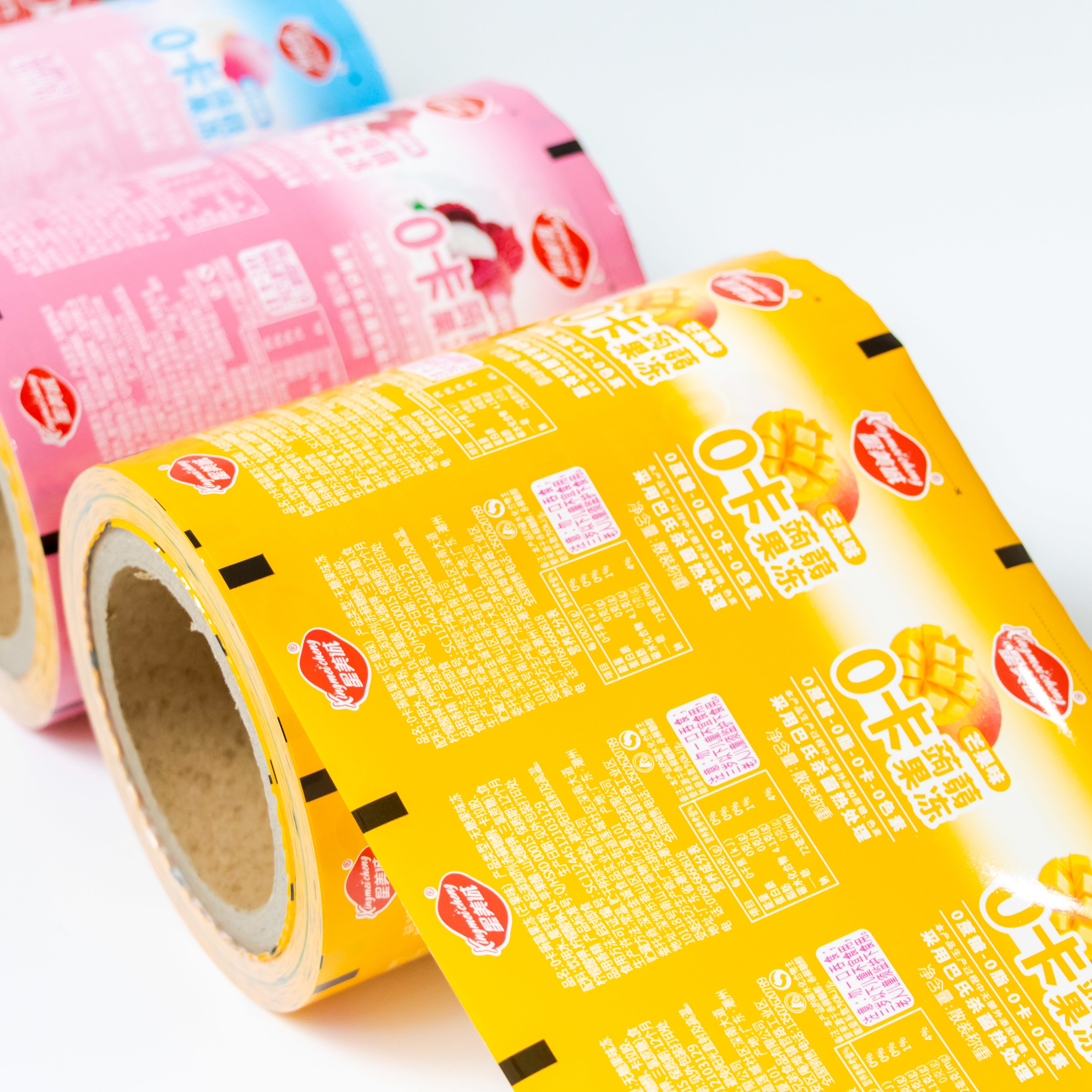
1. Use one color. This refers to selecting a color first, and then adjusting the transparency or saturation, so that the page looks uniform and layered.
2. Use two colors. First select a color, and then select its contrast color.
3. Use a color system. In short, it is to use a sense of color, such as light blue, light yellow, light green; Or soil yellow, soil gray, soil blue. In web page color matching, we should also remember some misunderstandings:
1. Don't use all colors, try to control within three to five colors.
2. The contrast between the background and the previous text should be as large as possible (never use complex patterns as the background), so as to highlight the main text content.
Next
Next
Guangdong Zhonghuan Printing Co., Ltd
Tel: +86 768-5423088
Mobile:19924860240 (WeChat)
13827310558 (WeChat)
Email : zohapackaging@163.com
Address: Middle section of Anbei Road, Xiayuan Village, Dongfeng Town, Chao'an District, Chaozhou City
Copyright © 2023 Guangdong Zhonghuan Printing Co., Ltd


